Hi, I'm Garrett, a newish UX designer at EchoUser. Recently my compadre Felix and I spent several months redesigning a complex user interface for a client's cloud computing software platform. (I use the word compadre without whimsy; it can mean co-parent or companion in war. I feel those definitions are accurate). It involved a lot of coffee, head scratching, and
frequent guttural sounds of pain intense abstract thought. There was plenty of "board-burn" (drawing or erasing recklessly, chafing the skin on the bottom of your pinky or palm) and ink-stained fingers from using them as erasers. We laughed. We cried. We made.
For your viewing pleasure I've put together a few snapshots of our experience. Enjoy.
A lot of work goes into a conceptual redesign. In fact, a lot more that you can see here. But hey, a 70+-frame GIF is pretty ridiculous as is.
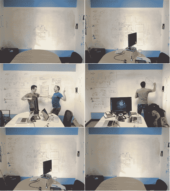
In the end, we came out with all our limbs intact and a kick-ass design. However, we did look a bit like the post-rescue Chilean miners.

Super design requires super people:
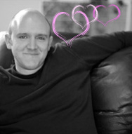
Aaron-Winning Smile-Rich. Pants Charmer. Project Captain.
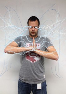
Felix-Raiden-Desroches. Storm Summoner. UX Master.
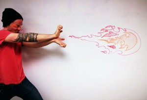
Garrett-Ryu-Godsey. Hadoken Hurler. Pixel Warrior.
And that's pretty much it in a nutshell.
Until next time, adieu.