My uncle is an interesting guy and the ultimate salesman: when he was in his 20s he peddled "designer" handbags, clothes and shoes that he had designed himself. He had no product development background, zero experience with the materials - but boy could he make a sale. From there he moved on to found one of Quebec City's largest restaurants (now closed down), run a construction firm, and start a TV set-top box reselling business, which he now continues to operate even in retirement.
If my uncle lived by any mantra, it was definitely "never,
ever take no for an answer".
This approach can definitely deliver the numbers that salespeople are often interested in. From cold calls to random knocks at the door to the retail storefront, everyone in sales knows to probe a little deeper after the first "no". But how do we make sure that
persistence doesn't turn into an
annoying experience?
One of the problems, as I see it, is that many companies just assume that "regular" persistent sales tactics will work just as well in a virtual environment (like the web). This is how pop-ups work, as well as their v2.0 brethren, those annoying little flashy ads that drop down and obscure half the screen (which have even, apparently,
made it into our inbox). Or rather, this is how these ads
don't work.
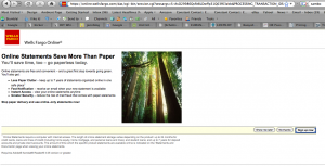
A case in point is my Wells Fargo welcome page. For 5 out of the last 6 times I logged in to see my account details, I was greeted with something that looked like this:

The content of the ad varies very little: usually it's an offer for Wells Fargo's "vSafe" security service or some paperless statement option, and invariably I hit "No thanks". From a basic logic point of view, then, you would expect that I would never see the screen again, right?
Wrong. It appears that Wells Fargo has made "No thanks" mean the same thing as "Show me later" (which, incidentally, begs the question of "Show me
what?"), which is immensely displeasing. Not only is Wells Fargo ruining my user experience every time I check my balance, but it ends up annoying the people around me who have to listen to my sighs of exasperation.
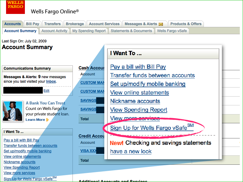
Interestingly, it's not as if Wells Fargo doesn't take other chances to sell you the same services later on in your banking experience: my main account page offers the vSafe service in the left-hand toolbar, just in case I change my mind.

The lesson for user experience designers - especially those working on the web - is this: the sales tactics that work out in the real world don't necessarily translate well online, and choosing how to apply and/or modify them is what separates the great experiences from the bad.
The lesson for Wells Fargo is much simpler: no sometimes really does mean no.
