It’s 7:00 a.m. and I am crammed into a bus packed with commuters. As I try gingerly to prevent my face from rubbing against the armpit of an adjacent passenger, I awkwardly suspend my clipboard over my head and try to take notes on every aspect of the experience. You see, while other passengers are traveling to their offices on this bus, for today the bus IS my office.
So why might you ask am I here? I’m working on my first project as a newly hired User Experience Researcher/Designer at EchoUser, and I am meeting my 3rd transportation study participant for BART and AC Transit.
The purpose of this study was to gain insight, through a series of “ride-along” user experience sessions, into the transit experience issues that are most important to BART and AC Transit customers. Ultimately, we were not only hoping to collect issues and experiences that we observed during participants’ ride-along sessions, but also to prioritize them using our User Experience
Magnitude Estimation Technique. Our method would help BART stakeholders to learn about customers’ expectations, as well as compare against perceptions of other transportation services (such as Muni and Caltrain). Finally, we would propose (and discuss) potential service design solutions based on the outcomes of our analysis.
At the start of this particular day, my participant happened to be about 10 minutes late to meet me at her bus stop. Luckily the AC Transit bus was equally late, allowing me to conduct my usual introduction after she arrived:
- Introduce myself, thank the participant for participating, and provide a brief overview of the ride-along study she is about to participate in
- Give a 30 second training exercise which introduces her to how we measure User Experience using Magnitude Estimation ratings
- Expose her to a written example of a poor transportation experience as a reference point for her ratings
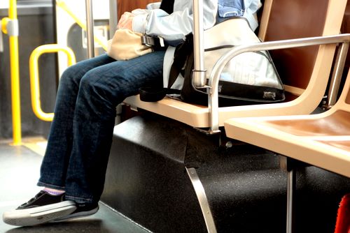
When the bus finally pulled up, I could immediately sense that this particular session would be a challenging and interesting one. The bus was now 15 minutes late and packed to the brim with commuters. As my participant and I crammed in, the bus driver yelled at an uncomfortable volume “Move to the back”, and I was promptly shoved into the armpit of a fellow traveler. Un-phased, I focused on my participant and her surroundings, and began taking notes. As we continued the journey, I tried my best to discreetly ask her questions, a combination of user experience ratings and survey style questions about her transit habits and experiences.
While this was a new adventure for me, it was a significant step for my company as well. Our methodology had already proven successful in the realm of software product design, but now we were expanding further into general experiences in other industries. This without question, turned out to be a valuable experience for me, as well as a great success for our business.
While publishing all of the results of this project would be beyond the scope of this article, I would like to share a few charts from our data analysis to give a sense of how we measure experiences.
The most important thing to consider when glancing at these charts is that the numbers are comparable and proportional to each other (in other words an experience of 20 is twice as good as an experience of 10). They are not necessarily meaningful on their own (such as an individual “event” with an average experience of 20). The reason we can compare these ratings (even to other transit products), is because of the reference experience we expose our participants to (which is purposely poor and has a rating of 10, indicated on the charts below as a red horizontal line).
The following chart shows a comparison of average user experience for customers that took BART, AC Transit, and combined BART and AC Transit rides:
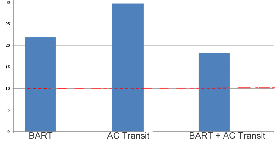
Here we can see that AC Transit is on average a
36% better experience than BART and
63% over combined BART / AC rides from our study. As it turns out the reason for this trend is quite simple. AC Transit rides that are not connecting to BART tended to be much less crowded (and therefore a better experience) than bus routes that connected to BART stations.
To further illustrate this scenario we can look at the following chart, which shows an example of average user experience (percent better than expectations on the y-axis and percent better than average usability for this study on the x-axis) for a series of events that are components of a combined BART and AC Transit ride:
- Waiting for the AC bus
- The bus ride itself
- Transferring (or navigating) to BART
- Entering the BART station, passing through the turnstiles (and buying a ticket if needed)
- Riding the BART train
- Exiting the BART station
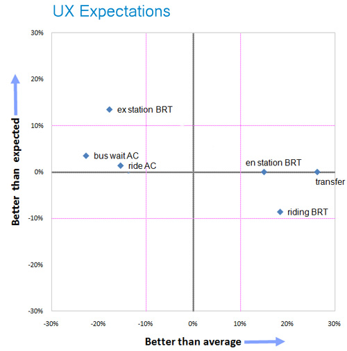
Here we can clearly see that the lowest scoring experiences (indicated by the above chart as items to the left of the vertical 0% average usability line) tend to be related to the AC Transit portion of the ride, while the BART portion tends to be higher. This could be explained by the extra congestion AC buses end up experiencing that are connecting to a BART station. The BART ride tends to score higher because its trains have a much higher capacity, and can more easily handle the crowd of commuters that end up coming from (or connecting to) AC Transit. Specifically, we can tell that the lowest performing experiences (or events) are waiting for the bus and riding the bus itself. Conversely, transferring to the BART connection and entering the BART station seem to score the highest (over twice the usability of the low reference experience). When we focus on participants’ expectations (indicated on the above chart as the 0% horizontal line), we see that most experiences are quite close or exactly meeting expectations (plus or minus 10% of the 0% horizontal) with the exception of exiting the BART station which seems to beat user experience expectations by almost 15%. It is important to note that a users generally notice a 10% difference in experience.
A final chart I’d like to share with you is the perceptual comparison of the BART and AC Transit service against other transportation companies of the Bay Area:
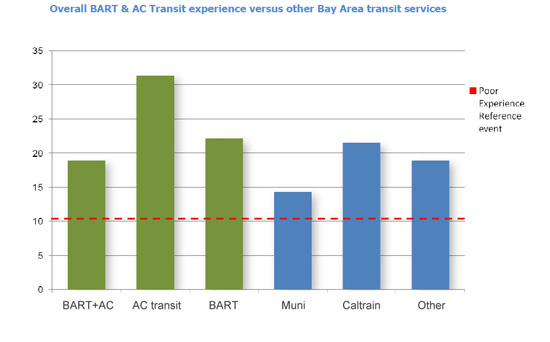
Muni seems to be rated at the lowest perceptual user experience of the group (less than half of AC Transit solo rides), but more interestingly BART is nearly equivalent to Caltrain (in fact beating it slightly).
Although I haven’t shared all of the data and findings from our study in this article, we can certainly see the value in measuring experiences, and how they might influence and direct product (or service) designs. There are many different approaches one can take in evaluating and researching a product or service, but I believe conducting “in the field” user experience research can produce very compelling observational and metric data, that can eventually lead to the highly effective design solutions for a product or service.

 It’s 7:00 a.m. and I am crammed into a bus packed with commuters. As I try gingerly to prevent my face from rubbing against the armpit of an adjacent passenger, I awkwardly suspend my clipboard over my head and try to take notes on every aspect of the experience. You see, while other passengers are traveling to their offices on this bus, for today the bus IS my office.
So why might you ask am I here? I’m working on my first project as a newly hired User Experience Researcher/Designer at EchoUser, and I am meeting my 3rd transportation study participant for BART and AC Transit.
The purpose of this study was to gain insight, through a series of “ride-along” user experience sessions, into the transit experience issues that are most important to BART and AC Transit customers. Ultimately, we were not only hoping to collect issues and experiences that we observed during participants’ ride-along sessions, but also to prioritize them using our User Experience Magnitude Estimation Technique. Our method would help BART stakeholders to learn about customers’ expectations, as well as compare against perceptions of other transportation services (such as Muni and Caltrain). Finally, we would propose (and discuss) potential service design solutions based on the outcomes of our analysis.
At the start of this particular day, my participant happened to be about 10 minutes late to meet me at her bus stop. Luckily the AC Transit bus was equally late, allowing me to conduct my usual introduction after she arrived:
 While publishing all of the results of this project would be beyond the scope of this article, I would like to share a few charts from our data analysis to give a sense of how we measure experiences.
The most important thing to consider when glancing at these charts is that the numbers are comparable and proportional to each other (in other words an experience of 20 is twice as good as an experience of 10). They are not necessarily meaningful on their own (such as an individual “event” with an average experience of 20). The reason we can compare these ratings (even to other transit products), is because of the reference experience we expose our participants to (which is purposely poor and has a rating of 10, indicated on the charts below as a red horizontal line).
The following chart shows a comparison of average user experience for customers that took BART, AC Transit, and combined BART and AC Transit rides:
 Here we can see that AC Transit is on average a 36% better experience than BART and 63% over combined BART / AC rides from our study. As it turns out the reason for this trend is quite simple. AC Transit rides that are not connecting to BART tended to be much less crowded (and therefore a better experience) than bus routes that connected to BART stations.
To further illustrate this scenario we can look at the following chart, which shows an example of average user experience (percent better than expectations on the y-axis and percent better than average usability for this study on the x-axis) for a series of events that are components of a combined BART and AC Transit ride:
 Here we can clearly see that the lowest scoring experiences (indicated by the above chart as items to the left of the vertical 0% average usability line) tend to be related to the AC Transit portion of the ride, while the BART portion tends to be higher. This could be explained by the extra congestion AC buses end up experiencing that are connecting to a BART station. The BART ride tends to score higher because its trains have a much higher capacity, and can more easily handle the crowd of commuters that end up coming from (or connecting to) AC Transit. Specifically, we can tell that the lowest performing experiences (or events) are waiting for the bus and riding the bus itself. Conversely, transferring to the BART connection and entering the BART station seem to score the highest (over twice the usability of the low reference experience). When we focus on participants’ expectations (indicated on the above chart as the 0% horizontal line), we see that most experiences are quite close or exactly meeting expectations (plus or minus 10% of the 0% horizontal) with the exception of exiting the BART station which seems to beat user experience expectations by almost 15%. It is important to note that a users generally notice a 10% difference in experience.
A final chart I’d like to share with you is the perceptual comparison of the BART and AC Transit service against other transportation companies of the Bay Area:
 Muni seems to be rated at the lowest perceptual user experience of the group (less than half of AC Transit solo rides), but more interestingly BART is nearly equivalent to Caltrain (in fact beating it slightly).
Although I haven’t shared all of the data and findings from our study in this article, we can certainly see the value in measuring experiences, and how they might influence and direct product (or service) designs. There are many different approaches one can take in evaluating and researching a product or service, but I believe conducting “in the field” user experience research can produce very compelling observational and metric data, that can eventually lead to the highly effective design solutions for a product or service.
