I had a great chat with
Johannes over at IDEO last week. Johannes is in charge of bringing some quantitative flavor to IDEO's magic, and he's up to some interesting stuff. After our morning coffee conversation, though, a few ideas stuck with me:
1. User churn
Me and the team at EchoUser have been getting more involved with start ups of late, helping them with usability, general user experience and the like. General start up concerns revolve around reducing "user churn", or in other words, "how to keep users interested and encourage ongoing usage of our product/service." It turns out that this is a sticky problem, especially when it comes to balancing the needs of new users (who might get "churned") and "habitual" users who already use the product on a regular basis.
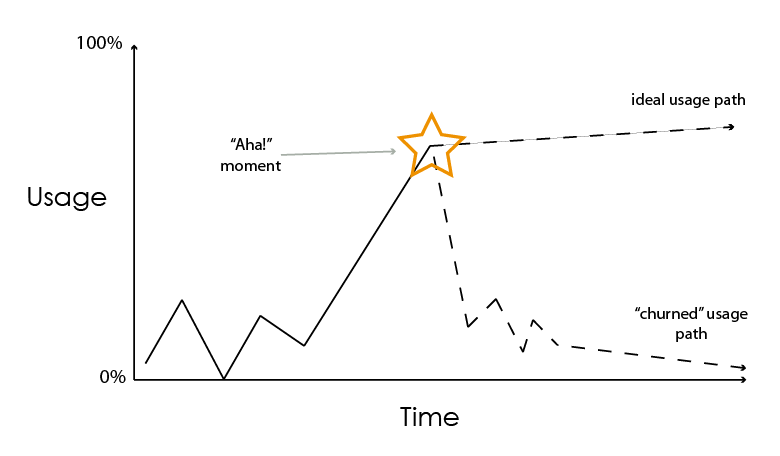
Our work inevitable hunts for what we've come to call "the aha moment", or that one particular experience that helps turn a casual/new user into a habitual one. Of course, we all know it's probably not one single experience that does the trick, but the simplification is helpful nonetheless.
In talking with Johannes I drew out what usage paths look like for a given product:

Ideally, you want users to take the path going up and to the right, because this means they've had their "aha moment" and have now become habitual users. And for start ups looking to raise funding from VCs, being able to say "our usability work has shown we can improve user churn by X% because we can guarantee an aha moment" is a very good thing.
2. Switching
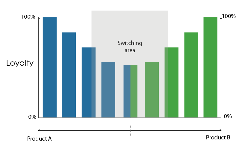
Then it was Johannes' turn to pick up the pen. He drew this, which deals with a marketing concept called "Switching":

Basically, switching refers to the idea that many people, when trying out a product or service, will tend to switch between different ones - this is represented by their degree of "loyalty" to a given product. The general point is to try to get users to either extreme, either 100% loyal to one product, or 100% to the other (to me this is a little simplistic, given that it's a zero-sum outcome, but more on that another time).
It's interesting to note that the Churn graph is a loose inversion of the Switching graph: users who have yet to experience their "Aha!" moment are less likely to become 100% loyal to a particular product - and therefore more likely to switch (as well as churn).
We're finding more and more that startups have to balance design changes that appeal to both habitual users and new ones, changes that try to straddle the divide between 100% loyal and "I'm not so sure just yet"-loyal. The balancing act is an interesting one to say the least, and we're using our usability special sauce to make it that much easier. More to come.