When I first encountered "flat design,” I fell in love with it. I thought: What could be more tempting than a clean and minimal interface-design style that can be even more beautiful and functional than visually busy solutions? As would any designer who is eager to try something new, I started to “flatten” all my incoming UI/visual design projects and hoped the results would look just as good as those beautiful examples I found online.
However, soon after I tried flat design in a couple of projects, I noticed something was wrong.
It wasn’t that my works looked absolutely horrible, but something just didn’t feel right. I almost thought my flat designs were "too flat." Overall, the works lacked personality and vibe, and everything looked so plain and dull.
Following frustration after frustration, I realized over time that a lot of special attention needs to be paid to create some tiny little “depth” in the flat world to keep the final design looking vivid and interesting. That extra depth not only provides more affordances and visual cues, but it also improves usability overall.
Here, I've created some example screens to showcase the tips I employ to create depth when making a flat-design interface. Although these screens are far from perfection, I hope they can at least be a starting point for you when brainstorming different visual design directions.
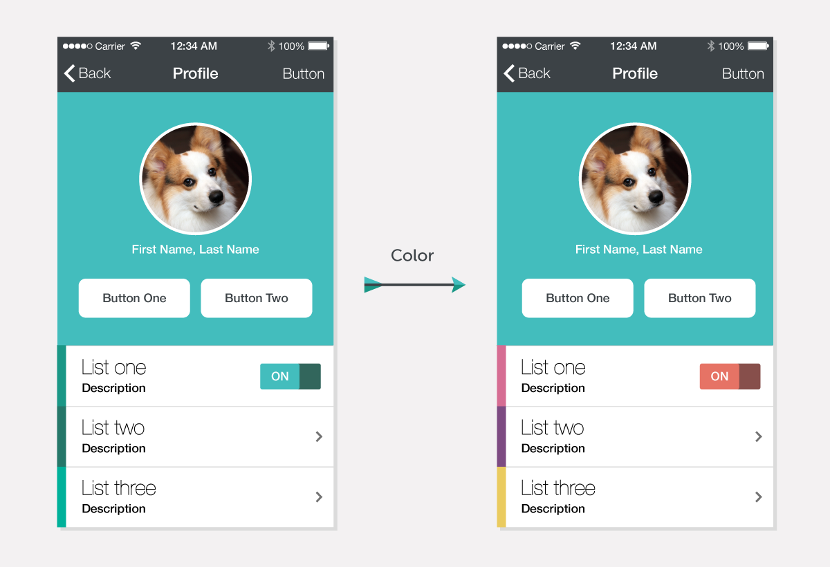
1. Colors
Cognitively, human eyes are more sensitive to some colors than others. (
See this detailed graph.) Thus, a colorful design can naturally bring more layers and contrasts into an interface than a monochromatic approach can. The dashboard from
Fitbit, Apple's
Healthbook app, and the to-do-list app
Clear, for example, all incorporate a very colorful palette into their interfaces.
2. Photography
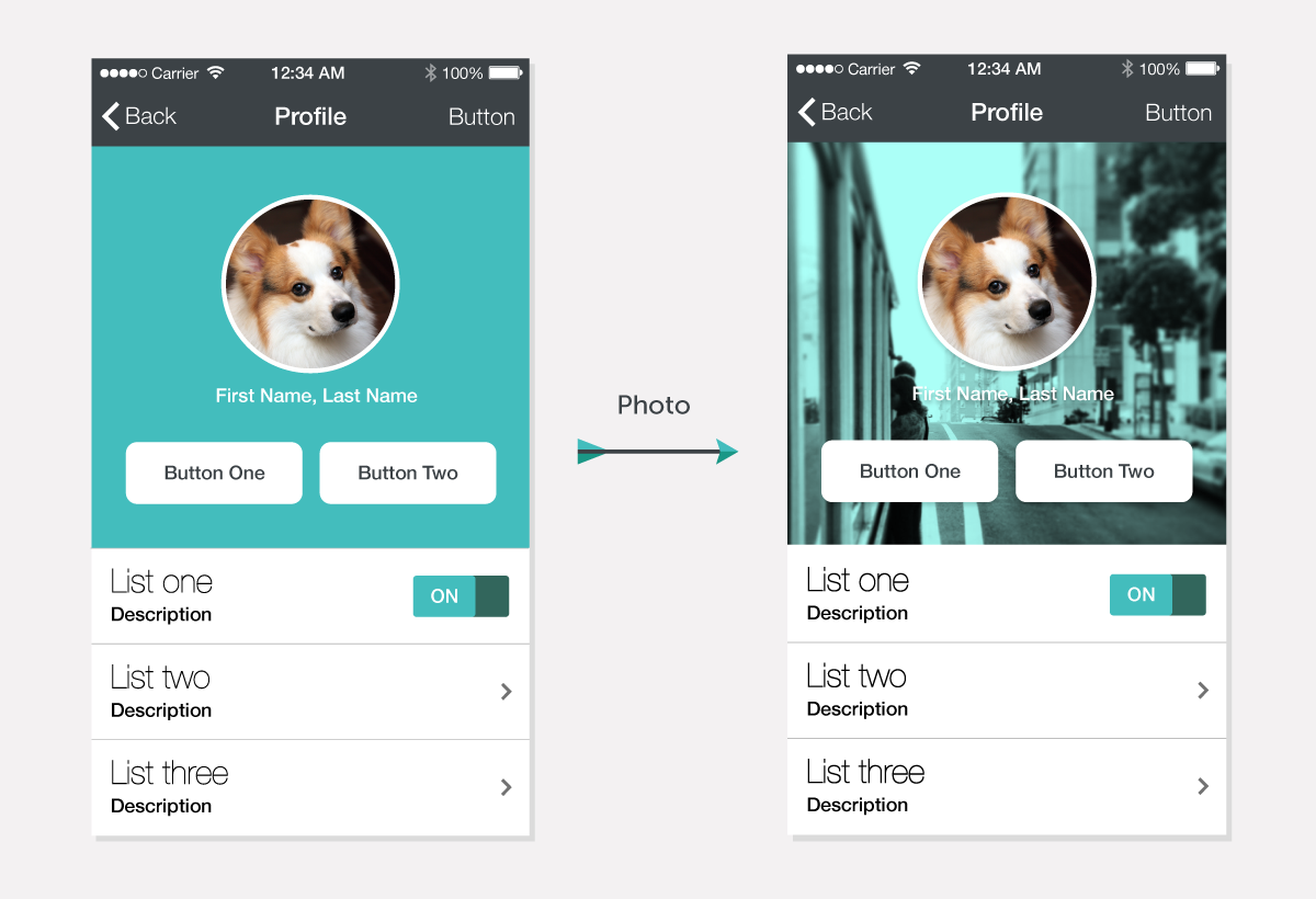
Not every theme is appropriate for a colorful design. Oftentimes, corporations' identities are limited to only one or two primary colors. In this case, photography — especially full-spread photos with a bit of perspective — becomes a nice medium to bring more depth to a flat interface. It works really well on many companies' landing pages like
Airbnb and
Treehouse. You can find more examples that combined photography and flat graphics together on
Land Book.
3. Subtle Layer Effects
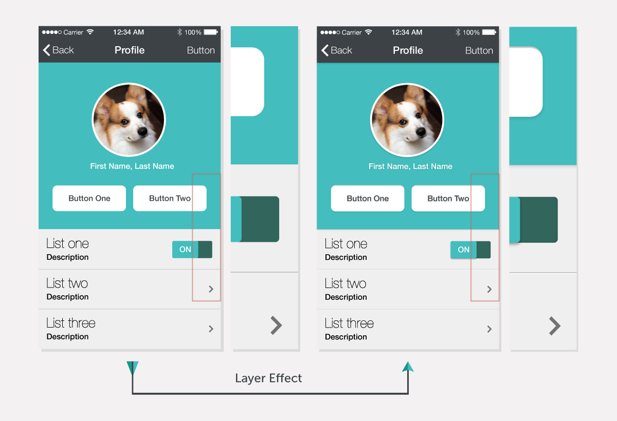
I used to think that one of the principles of flat design was to avoid using layer effects as much as possible. Things like drop shadows were evil. However, after taking a closer look at many flat design examples, I was surprised by how many flat-looking interfaces actually have a lot of layer effects applied. Those effects are subtle to a point that they look “
Almost Flat." One example that might be familiar to you is Google’s web interface. For instance, Gmail's page is generally flat, but subtle shadows are applied to buttons, where the “extra depth" is needed to enhance usability.
4. Subtle Gradients
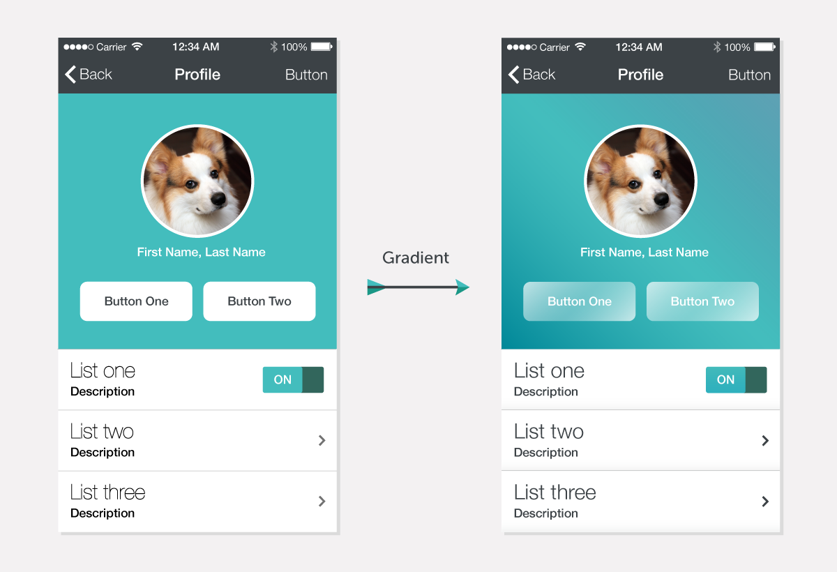
I used to think that gradients, like layer effects, were one of the most evil techniques when it comes to flat design. Ever since iOS7 was released, people have criticized its dramatic and inconsistent gradients. (See this
Tumblr thread.) Although it’s very easy to overdo gradients and make designs look garish, gradients can be a great tool to create that tiny extra affordance when applied moderately.
5. Blending Mode: Multiply
When it comes to creating flat-looking icons and illustrations, I really enjoy playing with the multiply blending effect between different-colored shapes. This technique creates a darker shade in the intersecting areas, which creates that extra layer of depth but still goes hand in hand with flat design. Some examples are websites from
General Assembly and
23andMe as well as the
iOS7 Photos icon.
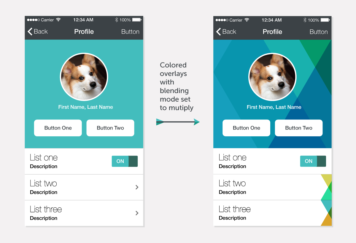
Note: Blending modes let you vary the ways that the colors of objects blend with the colors of underlying objects. It's a common feature in graphic design programs like Adobe Photoshop and Illustrator. (See more blending options:
Photoshop,
Illustrator.)
Other "Outside-of-the-Box" Inspiration
Flat-design interfaces tend to look alike when everything is minimal to an extreme. It’s getting harder and harder to create something original by just looking at other well-designed apps and websites. In order to think outside of the box, I often turn into illustrators’ portfolios to get more inspiration. Some flat-looking illustrations that I like a lot are from
Kelli Anderson,
DKNG Studios and
Jack Hughes, to name a few.
Bottom Line
The decisions made in visual design are closely tied not only to pure aesthetics but also usability. The tips mentioned above are meant to provide some ideas — which doesn’t imply that one method is better than the other or that the methods are mutually exclusive. Oftentimes, I'll try a combination of different approaches and see how things play out. No matter what technique is used in the end, the result should always be a conscious decision that enhances the overall interaction with the UI and reflects a brand's identity.