We're just hours from Facebook's IPO hitting the stock market, and whatever happens, it's likely to make waves in Silicon Valley and across the United States. But Facebook's 900 million users might not be aware of a key part of the business or marketplace side of Facebook: how the company profits from advertisers.
I thought of Facebook only as a social networking site until a few months ago, when I started trying to build a Facebook page for my blog. All of a sudden, as opposed to being a typical end user, I became a user who might be a business owner or an advertising or PR representative for a company or organization. To those users, Facebook can be a "marketplace" to attract and engage with more customers. With help from a friend who works on Facebook's ads team, I was able to get some ads credit to try out the process of creating, modifying, and eventually evaluating my ad strategies.
And, of course, wherever there's a user, there's a user experience!
After spending one hour going through the process of building my first Facebook ads, here are some interesting thoughts from a UX perspective:
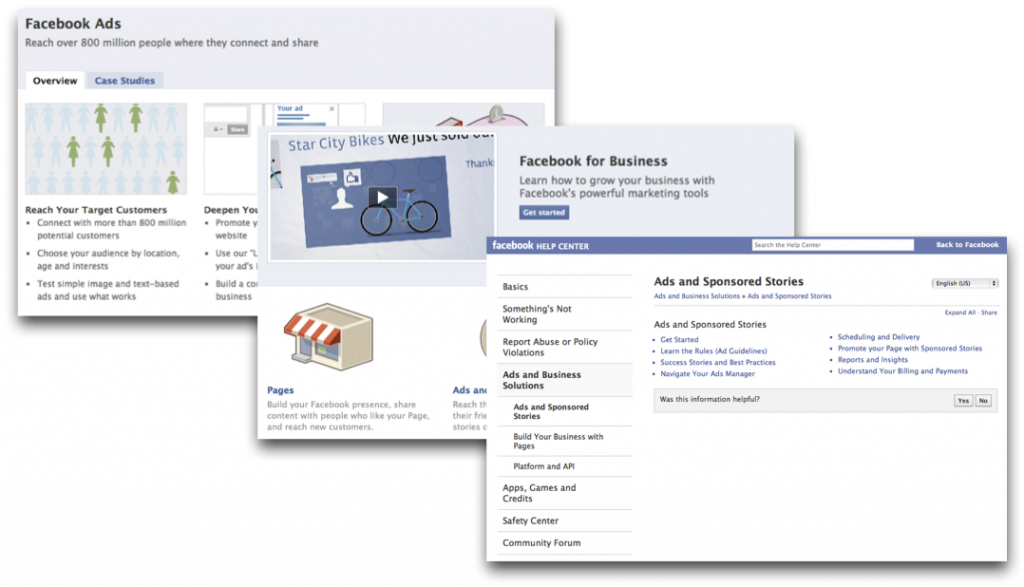
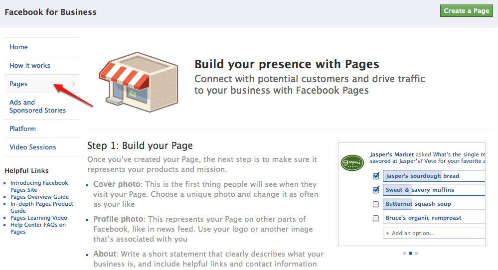
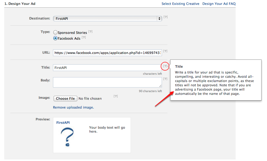 You would expect Silicon Valley companies like Facebook to come up with products that are unified, user-friendly, and well-supported, but when it comes to business users, that might not be the case. Similar to some notorious enterprise software, Facebook still requires users who would like to post ads to download and sift through pages of start guide PDFs, and trying to figure out the step-by-step flow for building an ad for the first time can be a struggle. If Facebook ultimately wants to let every small shop owner quickly get the concept of Facebook ads and build ads for their business (without shelling out for an online ads consultant), there's still room for Facebook to improve.
- Have a unified portal

- Always assume your users are starting from ground zero

- Have support ready for users along the way
 You would expect Silicon Valley companies like Facebook to come up with products that are unified, user-friendly, and well-supported, but when it comes to business users, that might not be the case. Similar to some notorious enterprise software, Facebook still requires users who would like to post ads to download and sift through pages of start guide PDFs, and trying to figure out the step-by-step flow for building an ad for the first time can be a struggle. If Facebook ultimately wants to let every small shop owner quickly get the concept of Facebook ads and build ads for their business (without shelling out for an online ads consultant), there's still room for Facebook to improve.