Hi! I’m Amy, and I’m interning for a few months at EchoUser. For my first task here, I looked at the design and usability issues at a Starbucks and a Peet’s in San Francisco, from ordering coffee to throwing away the cup. My goals were to identify positive aspects of both shops’ usability and design and to identify some trouble spots and propose solutions. Here’s some of what I found:


Ordering and Picking Up Food and Drinks
Both Peet’s and Starbucks had issues with the lines where customers order their food and drinks. In Starbucks,- The pick-up area is too compact to accommodate customers who have placed orders and wait to pick up food and drinks.
- There is no clear sign to indicate where customers should line up for ordering.


Enjoying Food and Drinks
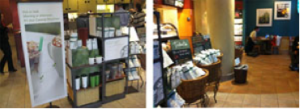
I also looked at the environment of the two shops and considered what customers would see when they came in to get their coffee or food. In Starbucks, the design on one side of the wall has a lot of fine art, but it is very plain on the other side.

Cleaning Up After Food and Drinks
One thing that stood out at Peet’s was the design of the trash can. It isn’t artistic, and the usability of the trash can is not good either: Employees have to put up additional recycle and compost signs so customers know what trash goes in what slot, and the signs can easily fall down on top of the trash can.My Solutions
The following are pictures of the original and re-designed trash can for Peet's and a new direction signs for Starbucks. I decided these would be the biggest problems to tackle with a redesign because the trash can and direction signs would most improve the experience for users in these coffee shops. Before, there was no direction sign in Starbucks where customers should line up for ordering. This sign would help customers to go in the right direction for ordering.
