 Ux on the cheap
We're always on the look out for cheap and easy (and quick and dirty) ways to get user feedback on products that don't break the bank or mess up our schedules. Ux simply doesn't have to be expensive or time-consuming. To this end, we definitely use a lot of the more common Ux tools that are out there: Visio and Omnigraffle for prototyping; Google Forms for quick surveys; the odd iPhone sketch pad to jot down ideas; a range of screen capture/sharing services like GoToMeeting, Webex, and, when we have to, Morae :: shudder :: All this in addition to our in-house user research tool, EchoUser Analytics.
And every so often we come across a tool that's intended for one thing but, with a little tweaking, can easily be bent to our Ux will. Enter Posterous.
That's prePosterous!
Preposterous indeed. Posterous, as I'm sure you know, is a super slick tool that lets people share thoughts, photos, video and other content on the web with ease. You simply email post@posterous.com, and voila, you have a new blog showcasing your content. Think of it as a slimmed down Tumblr on steroids.
Anyway, so there I was one day, working hard at
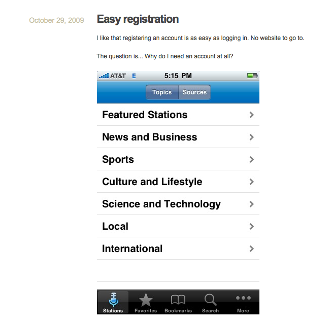
understanding Stitcher's user base, when I had an epiphany: why not use Posterous to help people track their Stitcher experience?! We already had a half dozen users participating in a 4-week diary study, so why not harness Posterous to let people take screenshots of their app experience, and add comments for more detail? Diary studies are great because they put you in touch with the user's voice (on paper), but they're a little tough because it's hard to actually
see what the user sees - Posterous was an elegant way to fill this gap.
Harnessing Posterous
Here's how it worked:
1. I created a custom site on Posterous that went something like UsabilityAtStitcher.posterous.com. Was a total breeze.
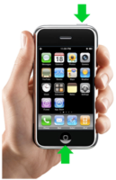
2. I emailed the diary study participants and asked them to send screenshots of any user experience moment that came to mind (good and bad). Because not everyone knows how to take a screenshot with their iPhone, I include this how to image:

3. I let the pictures and comments roll in.
In the end it was pretty fascinating to see which moments people decided to comment on and why. Some issues I was sure would come up didn't, and others were total surprises. It was also great to be able to show the Stitcher team the evolution of a user's experience over time with images and words. So the next time you're looking for a new Ux tool to add to your toolkit, maybe you don't have to look very far, after all.