In
my last post, I talked about how evangelizing perfection in our UX work is going to be a driving force for me in 2012. A funny thing happens sometimes when you put something out there like a goal: The universe has a way of stepping up and making you actually play ball.
EchoUser Re:loaded
Branding is tough. First you have to define what "branding" means, which is no mean feat (in my view, it's everything that encompasses the experience of a company or product, including identity, messaging, and literal product design). For the EchoUser team, branding refers specifically to our "identity" (how our brand is displayed to others) and how it should be manifested in our business cards, proposals, reports, etc. Our previous identity (below) worked for the first 5 years, but now that we're no longer really a startup, we decided it had come time for a refresh.

Our first logo
But where do you start? Do you brainstorm the different attributes of the EchoUser brand, find inspiration out in the world, and translate it all into a new look and feel? Or do you start by mapping out what's wrong with the existing identity (in our case: it's not cohesive, the logos are inconsistent, our collateral all looks different) and drawing out how things could be better?
Turns out, with us, we did a bit of both with an added twist of our own. The attentive among you will have noticed that our website got a significant revamp about 6 months ago — we chose this as the "practice run" for a rebrand because we felt that who we were (6 employees at the time and growing quickly) and what we do (kick-ass UX and design) wasn't being conveyed very well by the existing design — and man, was the redesign tough! A website is way more than just pretty pictures. It conveys who we are and showcases our voice; it exposes to the world our philosophy around user experience and design...each of these areas could take months if not years to define, and we decided to tackle it all first. The end result? A site that we love, but that took
2 years to get to a place we're all happy with. Ouch.
Naturally, I entered this broader rebrand effort with some apprehension — but I've been pleasantly surprised.
The first round of brainstorms focused on what the state of our identity is, how it's presented to clients, how we think it's received — and ways we think we can improve on it across the different media that people interact with (business cards, reports, emails, proposals, our portfolio, our logo...the list was endless!). Then we set our design genius (Amaya) to come up with some concepts of a look and feel that better embodies our brand 5 years on. We keep forgetting that we're no longer a scrappy little startup with everyone working remotely: we've tripled in size, work in an awesome office, and have a client list that has expanded and diversified as well. Some words to capture us, then? Simple, but mature; refined, but playful. Not an easy task.
What does the result of all our hard work look like? Well, you'll have to wait until later this year for the official unveiling, so in the meantime, I thought I'd take you through some past examples of our identity, so you can be suitably impressed when we reveal everything later this year.
EchoUser Through the Ages

Early logo. We really wanted people to understand that we were "experience innovation" experts, clearly.

A variant of our "echo" that we sometimes used with the main logo. Kinda reminiscent of an Apple app icon, now that I think of it.

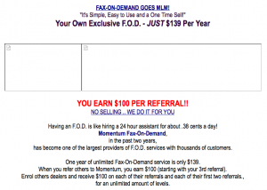
The website in 1999, before we even owned the URL. Thank god we came along, eh? :)

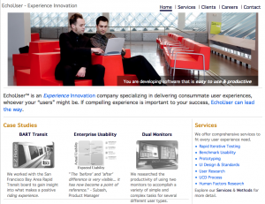
...and in 2008/2009 when Etan came on board with a revamp. Had no idea that the guys in the picture are apparently the founders of iStockphoto. Duh.

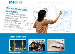
And finally, the website today (a big thanks to Shawna and Amaya for kicking butt, and Sally for being a model).