 Fast Company recently lambasted Nickelodeon for its logo change
, and I'm tempted to agree that it seems a little rushed.
Pepsi got a lot of flack for its logo change, as did
WalMart.
On the other hand, Google changes its logo - or at least modifies it - almost every month, and everyone loves it. It shows that with a little time and some care, logo design and design in general can be smarter and well-received. Nickelodeon, shame on you!
In homage to designer
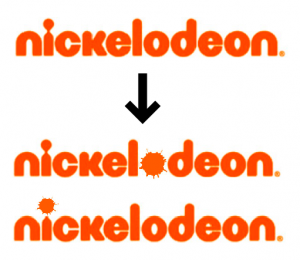
Dustin Curtis' American Airlines guerrilla redesign, here's a quick (literally, sub-2 minute) redo of the Nickelodeon logo that I think would have gone some way toward preserving their visual brand identity:
