Meet the EchoUsers: Amaya Lascano
Want to know more about our .gif connoisseur Amaya? Here's our interview with her.
1. How did you get into user experience design?
Let’s start at the very beginning (a very good place to start) ...I grew up in Bakersfield with two siblings and both of my parents being doctors. Our parents always told us just to figure out what we love to do and to pursue our passions - so of course, we all ended up in design. We were never pressured to go into medicine or in any direction we didn’t want to, which I really admire. While my brother studied animation design and my sister studied fashion design, I completed the Lascano design trifecta and went to school for graphic design at the Art Institute of California in San Francisco, which brought me to the city.My first job out of school was at AbsolutelyNew doing package design, which entailed making the boxes and doing the grunt work. Even though I wasn’t fond of package design in school, I really came to enjoy developing the technical skills I learned there. I was then promoted to Package Designer and started creating the content and graphics on the packaging, which was really more my expertise. After AbsolutelyNew, I went to PlayStation, where I designed thumbnails, web banners, themes and wallpapers for the online store. One of my wallpapers is still online to download, which — I’m not gonna lie — is pretty cool. It’s a Valentine’s Day promo wallpaper from back in 2009 featuring a robot holding a bouquet of controllers (check out the below).
After that, I started at Yodlee as a Junior Visual Designer, which is where I was first introduced to UI design. I didn’t even know that I could get into this scope of work because I was always under the impression that you couldn’t design the user interface without having to code it.
With Mick’s help, I was able to unlearn working with fear. He taught me how to stop doubting myself while working through something. Here, everyone is supportive and encourages you to make mistakes because that’s how you learn. Everyone learns alongside each other.
You also get your hands dirty and your feet wet right away. I was exposed to clients from the get-go and started learning right from the start. At other companies as an entry-level designer, you don’t have this exposure to client interactions. It may sound scary, but it’s an awesome way for people to learn.
You really have to try hard to have a bad time here. The people who work at EchoUser are incredible and have created a wonderful culture.
My suggestion was a rebrand. We explored what a rebrand really meant and did a deep dive into EchoUser’s brand and what we want our company to be. Garrett Godsey and I approached this in the same way we approach any project: by speaking to users. We interviewed every EchoUser employee to uncover what what we wanted the internal perception of EchoUser to be and what we want clients to see. It was very interesting and very indicative of the people who work here - everyone is savvy and forward-thinking. Ultimately, what we all have in common is that we all care a lot about EchoUser.
Using the UX process on ourselves has actually helped us improve what we do everyday. It changes how you think about things when you’re on the other side. We came up with several iterations of what could represent EchoUser’s brand, and once we decided on a few polished designs with Mick, we revealed these to the rest of the company for voting.
It was definitely emotional being on the other side of the whole process — but awesome how willing to help and excited people were. In the end it’s brought us all a little closer.
Not to call out anyone specifically, but too many times the image and language on a logo leaves nothing to the imagination. Visually, they end up being so literal and hit people over the head with it. The problem being, more often than not, you still don’t know what the company does. Sometimes brands evolve beyond, or are just bigger than, those overly simplistic logos, and it's frustrating that they aren't showing off their brand in the right way.
It’s like when I see someone with a really great body, but they’re wearing ill-fitting clothes. And as a visual designer, I’m like...IT DOESN’T HAVE TO BE THAT WAY! Find a designer who can help you!

I think personal style is a way to give people a taste of your personality and it’s an opportunity that is all too often overlooked and taken for granted. It’s the same thing with branding. It’s a missed opportunity if you don’t utilize your chance to express your company. A logo is a half second chance to catch someone’s eye. Your brand is your company’s personal style and you want it to be something people can connect with.

Also, don’t ever think you’re above any kind of work because once you think you’re too good for it, you cut yourself off from incredible experiences.
2. You had a lot of varied experiences before coming to EchoUser. What sets this company apart from previous places you worked?
I always say this about Mick: if he has a superpower, it is the ability to see potential in people that no one else can see, not even the individual. He saw something in me that I didn’t even know I had.With Mick’s help, I was able to unlearn working with fear. He taught me how to stop doubting myself while working through something. Here, everyone is supportive and encourages you to make mistakes because that’s how you learn. Everyone learns alongside each other.
You also get your hands dirty and your feet wet right away. I was exposed to clients from the get-go and started learning right from the start. At other companies as an entry-level designer, you don’t have this exposure to client interactions. It may sound scary, but it’s an awesome way for people to learn.
You really have to try hard to have a bad time here. The people who work at EchoUser are incredible and have created a wonderful culture.
3. EchoUser itself is in the middle of a bit of design update, which you’ve been leading. How is it different designing for yourself, rather than for a customer?
The rebrand was brought up in a very unique, yet awesome way. It was a part of our “Awesome Sauce Project” initiative, which asked each team member to propose something that could help EchoUser grow.My suggestion was a rebrand. We explored what a rebrand really meant and did a deep dive into EchoUser’s brand and what we want our company to be. Garrett Godsey and I approached this in the same way we approach any project: by speaking to users. We interviewed every EchoUser employee to uncover what what we wanted the internal perception of EchoUser to be and what we want clients to see. It was very interesting and very indicative of the people who work here - everyone is savvy and forward-thinking. Ultimately, what we all have in common is that we all care a lot about EchoUser.
Using the UX process on ourselves has actually helped us improve what we do everyday. It changes how you think about things when you’re on the other side. We came up with several iterations of what could represent EchoUser’s brand, and once we decided on a few polished designs with Mick, we revealed these to the rest of the company for voting.
It was definitely emotional being on the other side of the whole process — but awesome how willing to help and excited people were. In the end it’s brought us all a little closer.
4. If you could redesign any brand -- past or present -- what brand would you want to get your hands on?
There are a few brands that I would love to redesign - but more than any one brand is a specific type of logo that I see way too often - the “see-say” logo. This refers to a logo or brand where you can see exactly what they are trying to say.Not to call out anyone specifically, but too many times the image and language on a logo leaves nothing to the imagination. Visually, they end up being so literal and hit people over the head with it. The problem being, more often than not, you still don’t know what the company does. Sometimes brands evolve beyond, or are just bigger than, those overly simplistic logos, and it's frustrating that they aren't showing off their brand in the right way.
It’s like when I see someone with a really great body, but they’re wearing ill-fitting clothes. And as a visual designer, I’m like...IT DOESN’T HAVE TO BE THAT WAY! Find a designer who can help you!

I think personal style is a way to give people a taste of your personality and it’s an opportunity that is all too often overlooked and taken for granted. It’s the same thing with branding. It’s a missed opportunity if you don’t utilize your chance to express your company. A logo is a half second chance to catch someone’s eye. Your brand is your company’s personal style and you want it to be something people can connect with.
5. You obviously love gifs. What fascinates you so much about them?
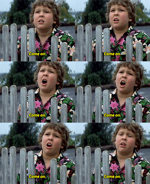
I really love gifs because they fit with my sense of humor and how I express myself. I’m a visual person, and this is a visual way to express emotion. I’m very animated and expressive when I talk, and gifs kind of allow me to write how I talk. For example, I often feel like this:
6. Any advice you’d like to share with new designers?
Be open to new experiences and don’t be afraid to fail because that’s where you learn the most. When you do fail (because you will!), you need to find a confidant. Someone you feel safe talking to and who can give you objective feedback. It’s so crucial because you need others to help you learn and grow. You never want to feel like you’re on your own, because that’s not true.Also, don’t ever think you’re above any kind of work because once you think you’re too good for it, you cut yourself off from incredible experiences.