 Konigi
, a designer who always posts interesting insights and contributions to the design landscape, recently wrote
an article about his thoughts on Thomas Malone's paper about design & learning from games. Definitely worth a read.
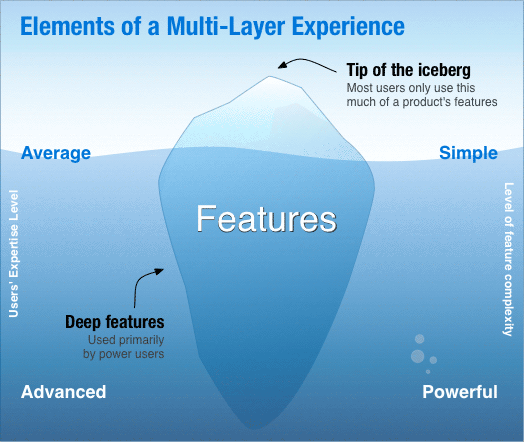
The concept he focused on is the idea of designing a multi-layer experience, where the majority of users can be satisfied with the simple features, but power users can "unlock" more advanced features, as they do when gaming.
The section below that he quoted from Malone's article definitely reminded me of usability tests I've done:
In a sense, a good game is intentionally made difficult to play, but a tool should be made as easy as possible to use. This distinction helps explain why some users of complex system may enjoy mastering tools that are extremely difficult to use. To the extent that these users are treating the systems as toys rather than tools, the difficulty increases the challenge and therefore the pleasure of using the systems.
It brought me back to those times I've tested particularly technical products, like testing the set-up and configuration of routers. Sometimes the participants (usually engineers) being tested will say things like "oh yeah, this is fine, I like it this way" even though the system seems unnecessarily difficult to use. They'll start acting
like they're in a game, saying things like "I know I can find this" or "maybe if I use the command line or <insert some other incredibly convoluted route here>, I'll be able to finish this task." And this type of person won't get frustrated - they'll get stimulated. And they'll feel special and smart because they're figuring it out.
Now, I'm certainly not advocating making an unnecessarily convoluted system for power users. But I think this speaks even more to the necessity of user research before design. It's important to address and simplify the usability issues. But it's also important to identify the key frustrations and pain points of users. For example, maybe you looked over a software system, did a quick heuristic analysis, and noticed 5 usability issues. It's not until you talk to the user that you would learn that 2 of the issues you thought were more minor are actually super frustrating to the users because they're annoying details they have to do 10 times a day. And maybe one of the other issues is not necessarily an issue for this user group but a challenge that contributes to the users' sense of worth and achievement in their field.