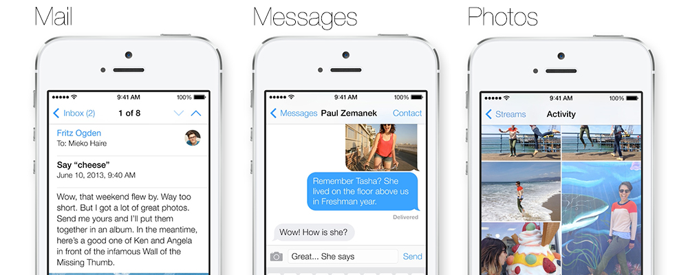
On Monday, Apple unveiled its newest platform at the WWDC. Some of us here at EchoUser were watching intently - especially for the iOS 7 reveals. Three of us (Garrett Godsey, Renato Verdugo, and myself) then sat down and looked through an early version of the brand spanking new iOS 7. Knowing that iOS 7 won't be available until the fall, and giving Apple the benefit of the doubt, here are the first look wins as well as some thoughts on the areas that need a lot more love before shipping.
WINS
Flat Design + Minimalism
The biggest change in iOS 7 is the overall look and feel. The new iOS has now trimmed the fat (and, thank goodness, the skeumorphism), and is now going "flat." However, we can't fully call it flat, as there are subtle shadows, lighting effects,and gratuitous amounts of gradient (which is not really a win for us).
Furthermore, the new iOS 7 uses Helvetica Neue UltraLight in its native apps, making it more "skinny." Most icons have even gone borderless and lack the bevel that we used to see. This cleaner look definitely helps the user to focus more on the content, instead of the frills around it.
Layered Look
Despite the new flat take on the OS, there is actually quite a bit of depth created by layered panes and parallax scrolling effects throughout the entire iOS. The new look is flattened and cleaned up without going "full Metro."
Photos App
Being the organized nerds that we are, we really appreciate how
Photos is now breaking up our image collections into an easily navigable hierarchy: Years > Collections > Moments.
Control Center
A few of us were geeking out over the
Control Center (doesn't take much to excite us here at EchoUser). By swiping from the bottom, there is a quick access panel for common settings (e.g. airplane mode, wireless, Bluetooth, DND, screen brightness, etc.) which is even accessible from the locked screen. One fewer tap makes Joanne a happy person.
Other Subtle Wins:
- Spotlight search is no longer on its own page on the far left of the iOS Springboard. Now, with a simple hold and swipe down, the user can access this anywhere on the home screen.
- Compass now has a level in it. Apparently, this was one of the first apps that Garrett had purchased when he got a hold of an iPhone - he claims it's probably one of the best utilities he has.
- The clock on the home screen is now alive icon, instead of being stuck on 10:15 all the time.
- Safarican now allow you to open more than eight tabs!
ROOM FOR IMPROVEMENT
Icons
I think a lot of the designers out there
felt like this when we saw the iOS 7 designs. We were absolutely confused by the inconsistent look and feel of the icons, not to mention the audacious neon gradients! Some icons have the white symbols on color; some have colored text or images on white; some are monochrome, etc. However, we recently learned that many of the
new icons were primarily designed by members of Apple's marketing and communications department, not the app design teams. So here's to hoping that the icons will be totally revamped and better in the Fall release.
Inconsistent Color Schemes
There are some inconsistent color schemes within the native apps. Although the messaging systems (e.g.
Messages,
Mail, etc.) have blue icons and text, so does
Photos. The font and icons in the
Music Player are a nice magenta color, but it's too similar to the red within the
Clock app. (On a side note, the yellow text superimposed on the white background in the Notes app was super difficult to read).

Photo source
Game Center
Although they've ditched the felt, the Game Center was atrocious with its glossy neon bubbles. We're hoping that there will also be a change in the
functionality of Game Center in the future iOS. Currently, the Game Centers in previous iOS versions have not been very user-friendly (and really, who uses the Game Center?).
Transitions
While playing around with iOS 7, we found that the transitions from apps to home screen were a bit jarring — and dizzying, too. We're hoping that the transitions will be a little bit more subtle.
Folders
In the old iOS, you're restricted to only 12 apps per folder. The new iOS 7 allows for more apps in one folder, with only 9 apps on the first folder page. We would think a better fix would to keep the 12 apps on the front page, or even move further away from the allegoric look, and make the folder bigger (by expanding it to a rectangle). It seems like a lot of real estate is being wasted in these folder screens. Also, we're not really feeling the dull grey box for the folders in iOS 7.
Work In Progress
Although the iOS has a total facelift now, to quote one of my friends: "It's like they didn't
YOLO." Apple could have gone even further and really seized the day, but something still felt unfinished. It is still a few more months until the fall, so we can't wait to see the new iOS 7 with all its finishing touches.