First…a little backstory…
About two years ago…I bought a white iPhone 4s. It was kind of a big deal for me because it was my first time buying such an expensive phone and wireless plan. Despite it making a huge dent in my wallet, I was happy because I was an adult making grown-up purchases with my grown-up money I earned all by my grown-up self.

I had my 4s for a little over 4 months when me and my big adult brain decided to go out dancing with my friends at Badlands. For those who are unfamiliar with what it feels like on the dance floor at Badlands, it looks a little bit like this (but x 1000)

My phone fell out of my pocket at some point in the night and I could only assume that a) some random person picked it up and took it home or b) it was trampled by dancing club-goers. Upon discovering that it would cost (gulp) $500 for a replacement phone, I went back to my OG-and-still-functioning 3GS that I had kept. Eventually, that thing died and my brother was kind enough to give me his old iPhone 4 when he upgraded to the 5. A little better than the 3GS (which was slow as molasses and liked to turn off whenever it felt like it), but it was a little annoying that it was still too slow to handle my mobile game addiction to Candy Crush and Bubble Mania.
I still remember
when iOS7 was announced months and months ago and not really taking a liking to it initially. It was such a drastic departure from a visual design standpoint. I think it overwhelmed me. It also didn't help that a large portion of the visual design community energetically pooh-poohed the avant garde approach to color. It pretty much felt like this…

The "flat" look that has been all the rage since the end of 2012 was very evident in the icon and app design; my first thought was, "Oh, Apple is just jumping on the bandwagon." Mind you, being "on the bandwagon" isn't necessarily a bad thing. But I think that given Apple's prolifically innovative design history to date, it caught me off guard that they weren't leading the pack.
Or so I thought. I didn't take into account how long it it would have taken to redesign all of iOS7 (my guess is that it took at least a year or more). I also didn't take into account how the operating system would look in the context of a higher screen resolution (a retina display).
Then this thing happened….

As soon as humanly possible after the Apple keynote announcing the new iPhone 5s & 5c ended, I was on Apple.com pre-ordering the new 5c in Yellow. The yummy candy colors and rounded molded plastic case had me drooling from the get-go. I couldn't help but think OMG HOW CUUUUUUTE! I MUST HAVE IT!


And treat myself I did.
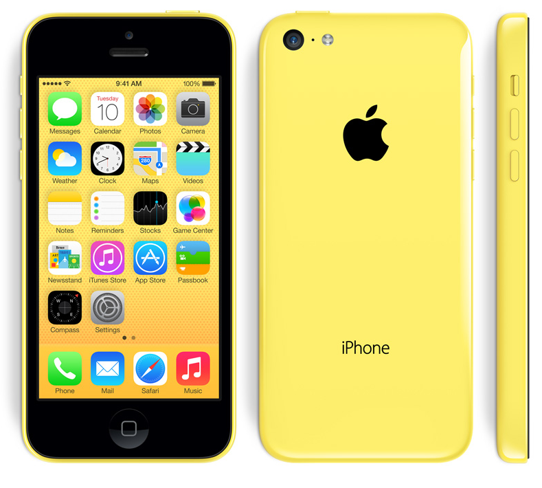
Not gonna lie, I was up all night the day I got it playing with my new toy. Whatever feelings of "meh" and "whatevahz" I feared were washed away when I hit the power button and the beauty that is iOS7 graced my screen. The "flat" look overhaul Apple shipped out made so much more sense nested in a retina display screen with the colorful outline subtly peeking out on the sides. I'm especially loving the light-weight font used in all of the Apple apps. Be still my graphic-design-y heart!
I could go on and on about how much I love the new iPhone 5c and iOS7 but then I'd just start to sound like I drank too much of the kool-aid. Which I haven't…and if you don't believe me then…then you should…coz I'm not a liar. Promise. Pinky swear promise.
