I spent last night at a lecture organized by
San Francisco BayCHI, hosted by
PARC down in Palo Alto. It was my first BayCHI event, and the group seemed lively enough - both speakers elicited quite a few laughs, and audience members weren't afraid to shout out comments and retorts during the lectures.
First up was
Ted Selker from MIT Media Lab and IBM fame. Ted seemed like a nice enough guy, and his talk tackled the various trials and tribulations he encountered as a technology product designer over the last 15 years or so. It was definitely interesting to see how he used 'experimental design' extensively to explore the intersection of humans and technology - and what its future might look like. This open approach to concept development - and their subsequent failures, many of them in fact, to reach market - resulted is dozens of inventions with varying applicability and real-world usability. However, to be fair, Ted has come up with some interesting inventions over the years, which is certainly a testament to his perseverance, even if very few seem to have made production. I would hazard a guess that this is because A) Ted was trapped in big organizations that resisted his avant-garde ideas, and B) he ignored one of his own "3 Principles of product design", the use of art and aesthetics. In short, everything I saw except for the One Laptop Per Child (for which as I understand it, he designed the keyboard and ears), was a little on the plain, boxy side. If Steve Jobs had a less successful, less aesthetically-obsessed twin, Ted is the guy. All in all, though, his body of work is definitely impressive.
Next up was Dan Roam, author of bestselling book
The Back of the Napkin (and
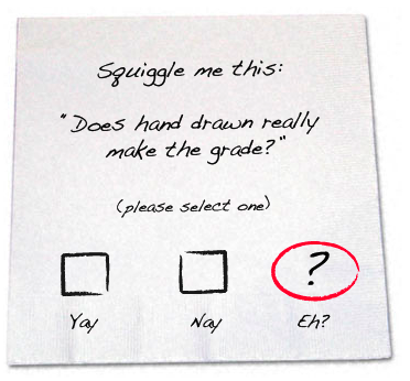
here). Like Ted, Dan was immediately engaging, and handed out napkins to signal that this wasn't a one-way lecture (of course, I forgot a pen, so didn't end up drawing along with everyone else!). He proceeded to outline the theory underlying his book, namely, that
any idea can be represented visually, with simple pictures - and positively impact any problem solving/decision making that follows suite.
Here are some snippets from his lecture that I think deserve a little more analysis:
Regardless of what our problems might be...we can solve them with pictures.
This I can definitely attest to: from abstract concepts to complicated schematics (dumbed-down for the medium, of course), just about everything can be represented visually. Dan made a limited neuro-biological case for why visual problem solving is so powerful, but even without knowing that of the neurons dedicated to processing sensory stimuli, over 75% of them deal with vision, I would have found myself nodding along. Pictures have a great way of literally grounding a problem, and providing stakeholders something to bounce ideas off of, engage with, modify. If this happens to occur on the back of napkin, that's fine too (interesting, the small size of napkin forces you to think more simply and condense - never a bad thing).
Unwritten Rule 1: Whoever best describes the problem is most likely to solve it.
Seemingly intuitive, but something that only really made sense when he said it. I remember that the whizzes in my high school advanced math class were those who could best articulate the problem at hand (which I always found so frustrating!). Interestingly, this made me realize that understanding can come in one of two ways: 1)
before the act of drawing pictures, which implies that drawing would be an exercise to explain and/or confirm
prior understanding, and 2) because, or after the fact, of drawing, with the implication that the act of drawing helped clarify in a way that would have been difficult without pictures. I definitely find #2 to be true, and regularly find myself having "Aha!" moments because I could link two concepts on paper that had previously stumped me.
Unwritten Rule 4: The more human your picture, the more human your response.
This was my favorite take-away: that humans are more instinctively drawn to artifacts that look man-made. Whether there's any data to back this up, the fact that companies like Visio and Omnigraffle are doing their best to make wireframes look hand drawn (as well as the
associated businesses and
bloggers that have taken note of this move) indicates that there's something there (I do find it ironic to say the least that we are now modifying computer programs to make things look more human, when we could simply draw them ourselves).
In any case, Dan's lecture definitely provided plenty of food for thought, and has got me thinking about how I can improve
my own simple drawing note-taking style.
Definitely keep an eye on BayCHI.org for the upcoming podcasts, and watch this space - I plan on tackling the issue of simple drawings (and how to integrate them into your work) in later posts.