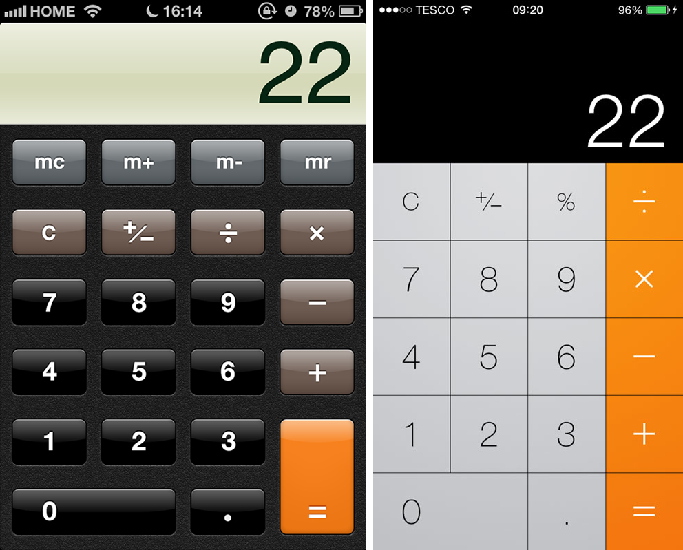
Skeumorphism. That gave you a chill down your spine, didn’t it? We definitely heard this term in the last few years, especially with the cheesy lined paper that we saw within our iPhones with its previous
iOSes.
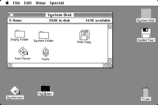
Skeumorphism dates back to the early 1980s. In 1984, Apple had introduced their first consumer GUI, where “folders” were manila folders and “trash” was represented by a trash icon. Contrary to popular belief, Skeumorphism was not a trend; it was a learning tool for those who were unfamiliar with computer interfaces. However, as personal computers are now becoming much more ubiquitous, users do not need to rely on the visual metaphors to understand the different functionalities.

Then in comes flat design. The term “flat design” has garnered more attention in the last year since Apple’s shift from its overly realistic UI to
flat design with
iOS 7. Flat design can
still be
skeumorphic. For example, the layout of the calculator in
iOS 7 is still a calculator (yet flat), but does not require the
realism (i.e.
beveled buttons) to get the idea across to the user. Flat design embraces visual minimalism, eschewing extreme usage of beveled edges, textures, shadows, and gradients, and opting for more of a simplistic look with a focus on UI elements, typography, and color.

Flat design certainly supports the notion of “less is more,” and in turn focuses on
user experience (something that I think we do quite well here at EchoUser). Designers are now returning to the Bauhaus-era basic fundamentals of "form follows function". Flat design strips away all the ornamental elements and visual noise that are deemed unnecessary, focusing on the content instead. Instead of being fixated on whether or not the shadow on a box is realistic enough, designers can focus their time and
effort on the usability of the product. We can even incorporate other elements, such as visceral interactions, animations, sound, and vibrations to create a more interesting and engaging experience.
Some may assume that flat design is easy. However, it definitely
is not! Designers must spatially arrange elements appropriately, to use color and typography thoughtfully, and create a strong experience while keeping it simple. When using flat design, be sure to have a user-centric perspective as well to ensure a unified and holistic experience.